Work
US Quadball
CASE STUDY

US Quadball — Brand Identity & System

A multi-year brand system for the national governing body of quadball, balancing one recognizable organization with flexible identities for teams, tournaments, education, and community communication.

Brand Identity
League Branding
Sports Design
Social Media
Apparel Design
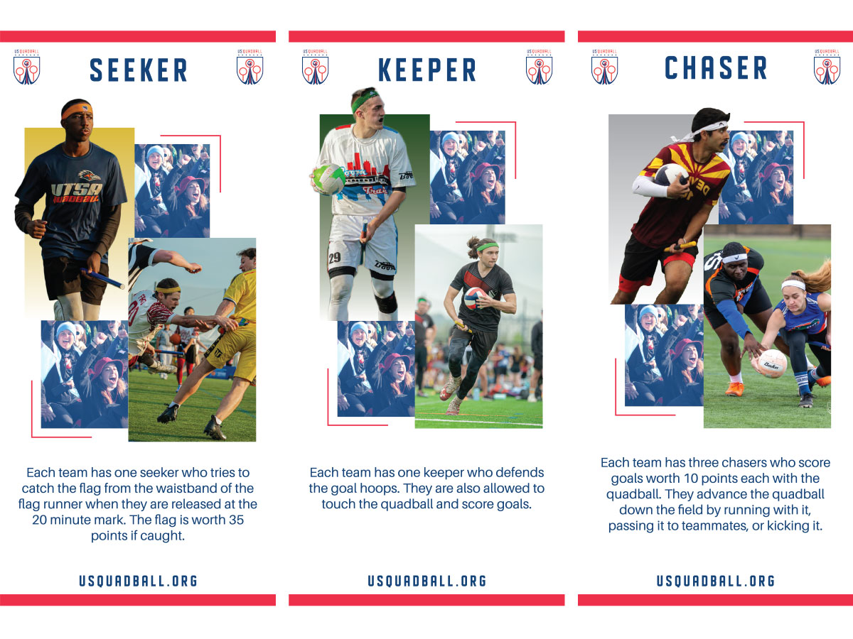
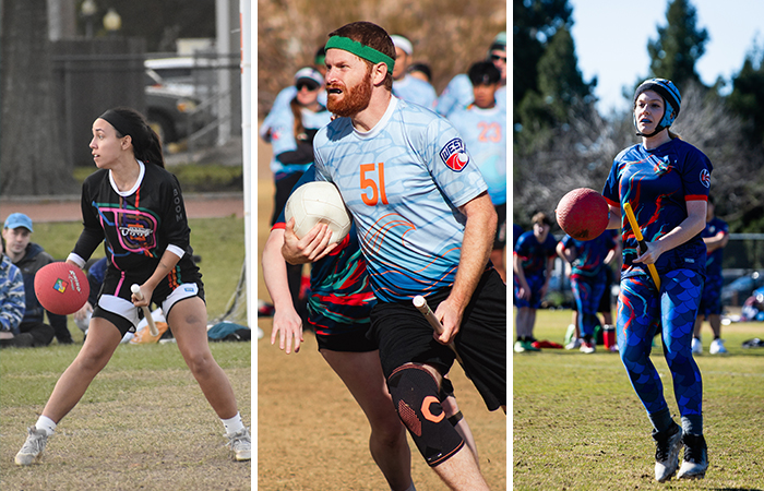
Quadball player carrying the ball during gameplay at a national competition.
Engagement
Multi-year collaboration
My role
Identity, systems, campaign design
Scope
National, tournament, team, education
Primary deliverables
Identity systems, event graphics, education, apparel
System objective
One framework, many identities
The challenge

Unifying a growing sports organization

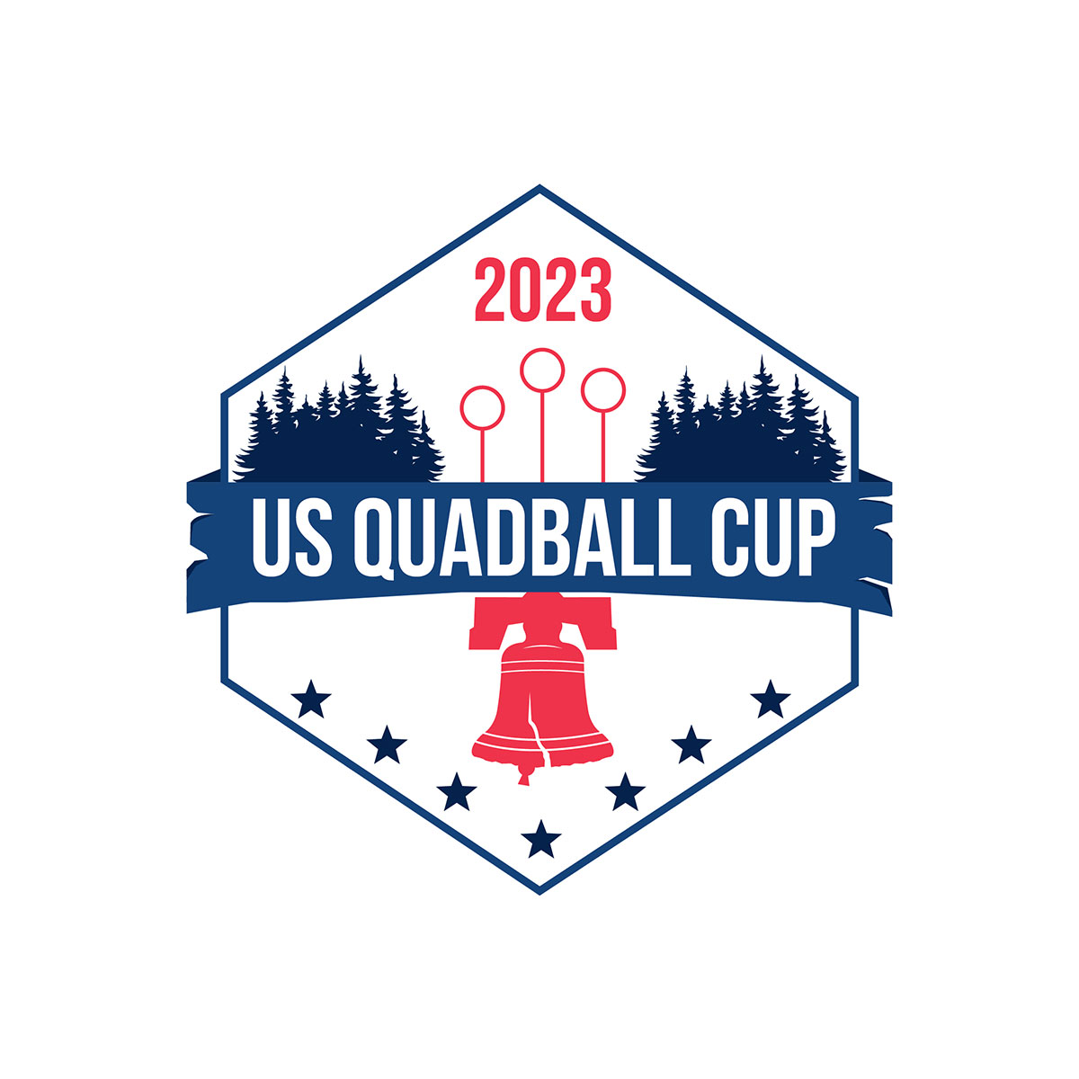
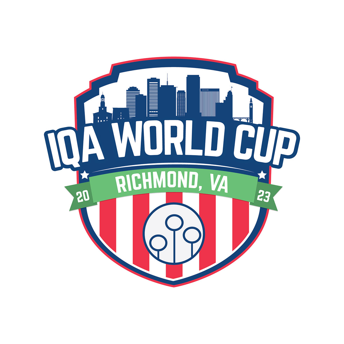
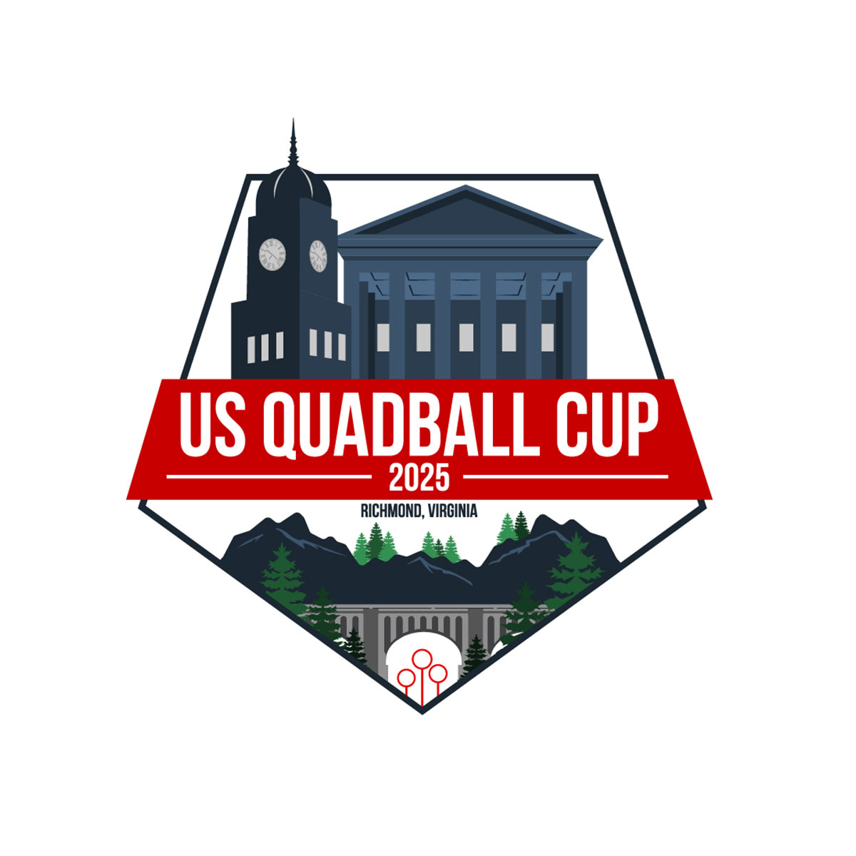
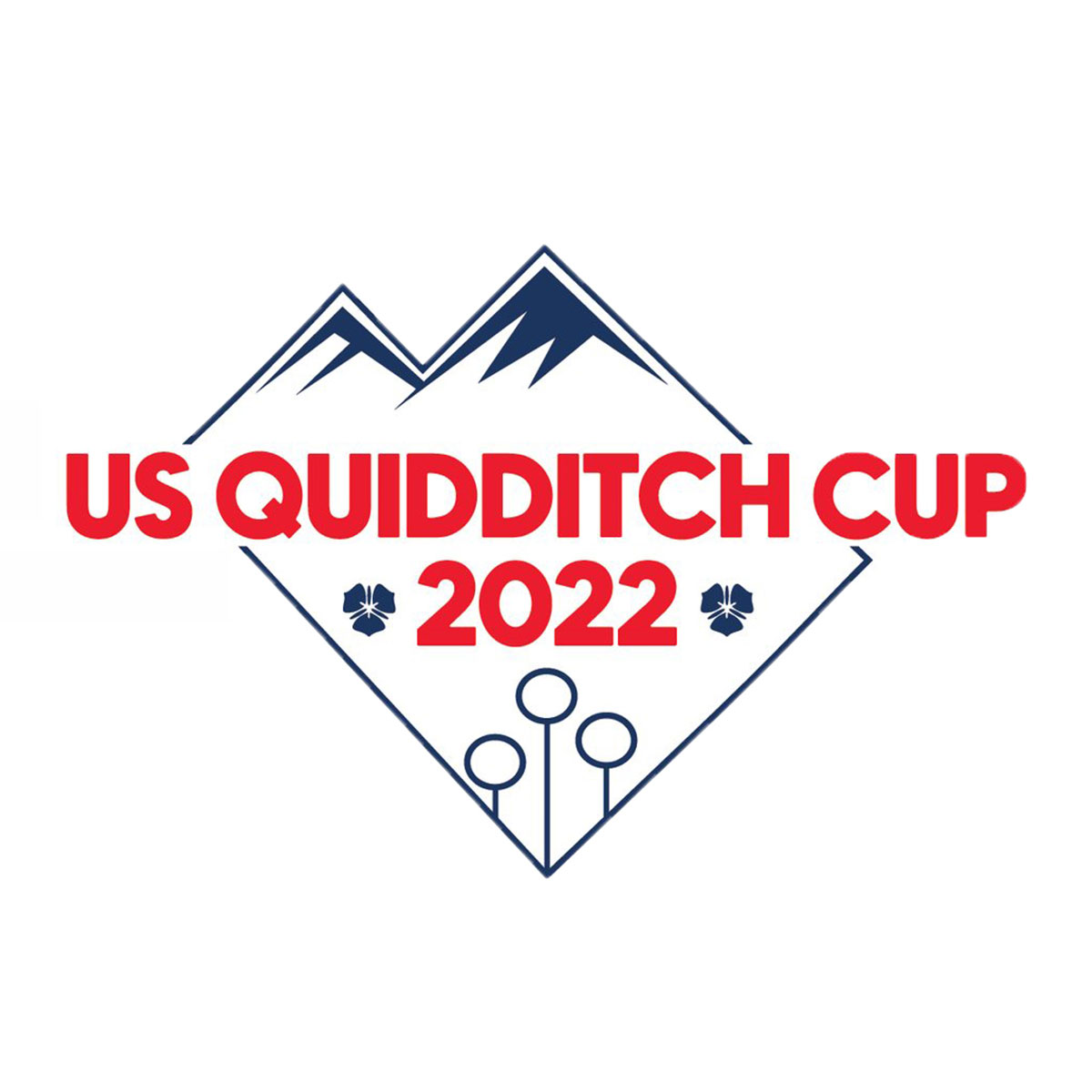
US Quadball is the national governing body for quadball in the United States, overseeing league operations, national tournaments, regional teams, and community development. The challenge was to create a flexible, recognizable brand system that could unify the organization without erasing the identity of individual teams and events. Some examples on this page predate the sport’s transition from the Quidditch name to Quadball.

My role and collaboration

Translating shared goals into an adaptable system

I contributed across brand identity, tournament and team systems, educational graphics, social content, and apparel applications over several years. The work was developed in collaboration with organizational leadership, event teams, and community stakeholders, with my role focused on translating shared goals into a clear, adaptable visual system.

The brand architecture behind the system
01

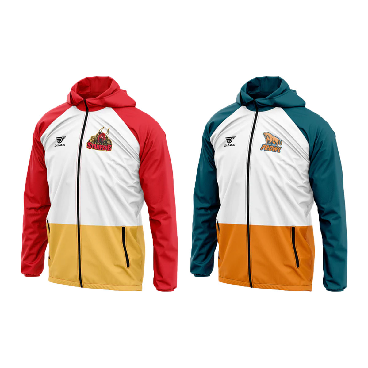
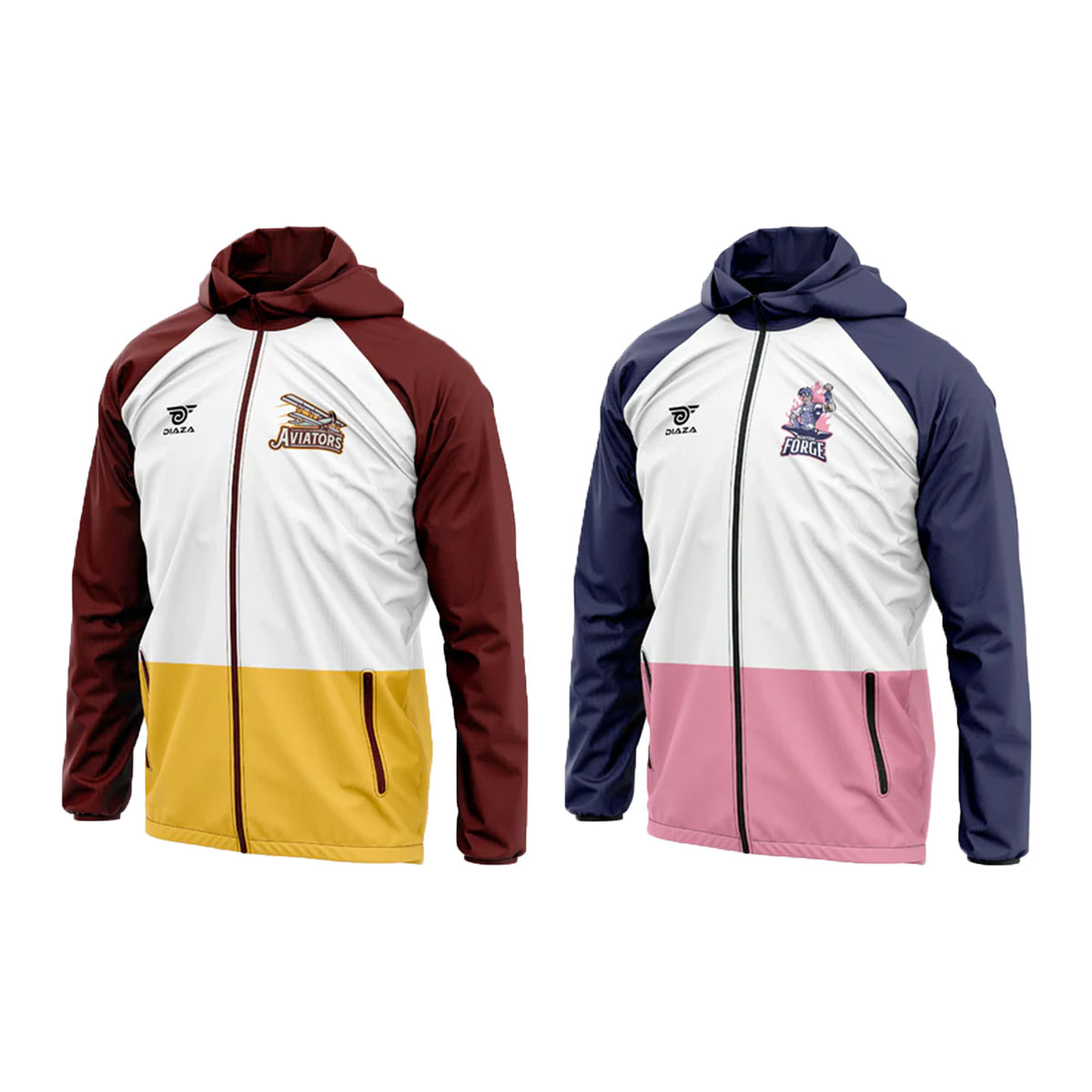
A modular logo system that could adapt across national, tournament, and team applications

02

A clear hierarchy connecting the national organization, tournaments, and teams without making every identity look the same

03

Athletic typography built for visibility, energy, and consistent use across event, apparel, and educational content

04

A scalable color framework that preserved national recognition while allowing regional and team-level expression

05

Rules designed to work across digital campaigns, educational graphics, apparel, merchandise, and live events

National organization
US Quadball
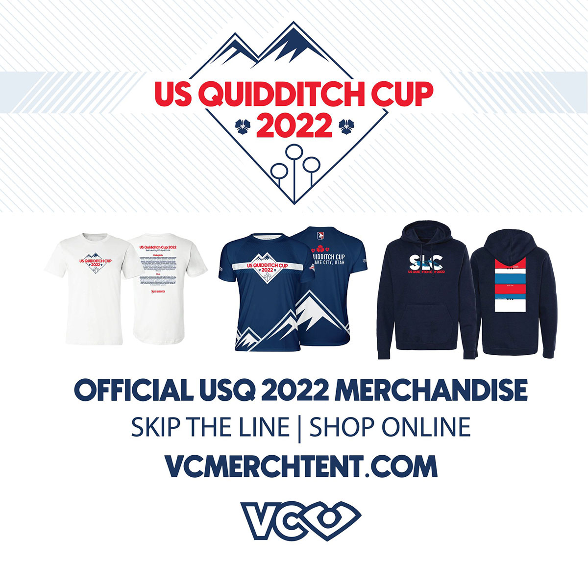
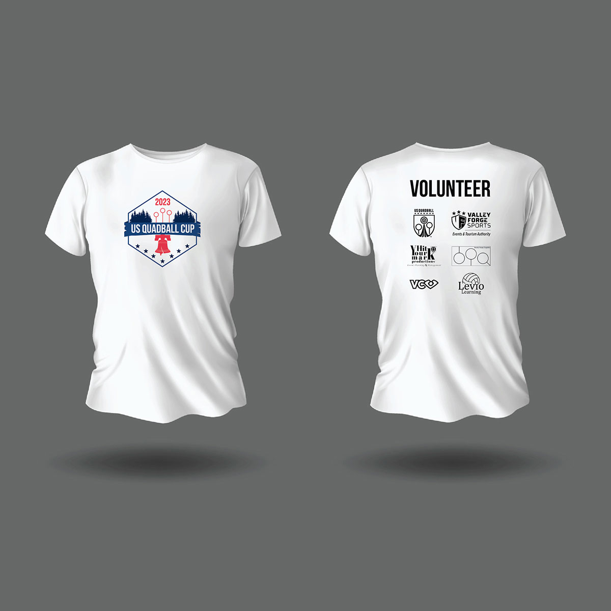
Tournament & event identities
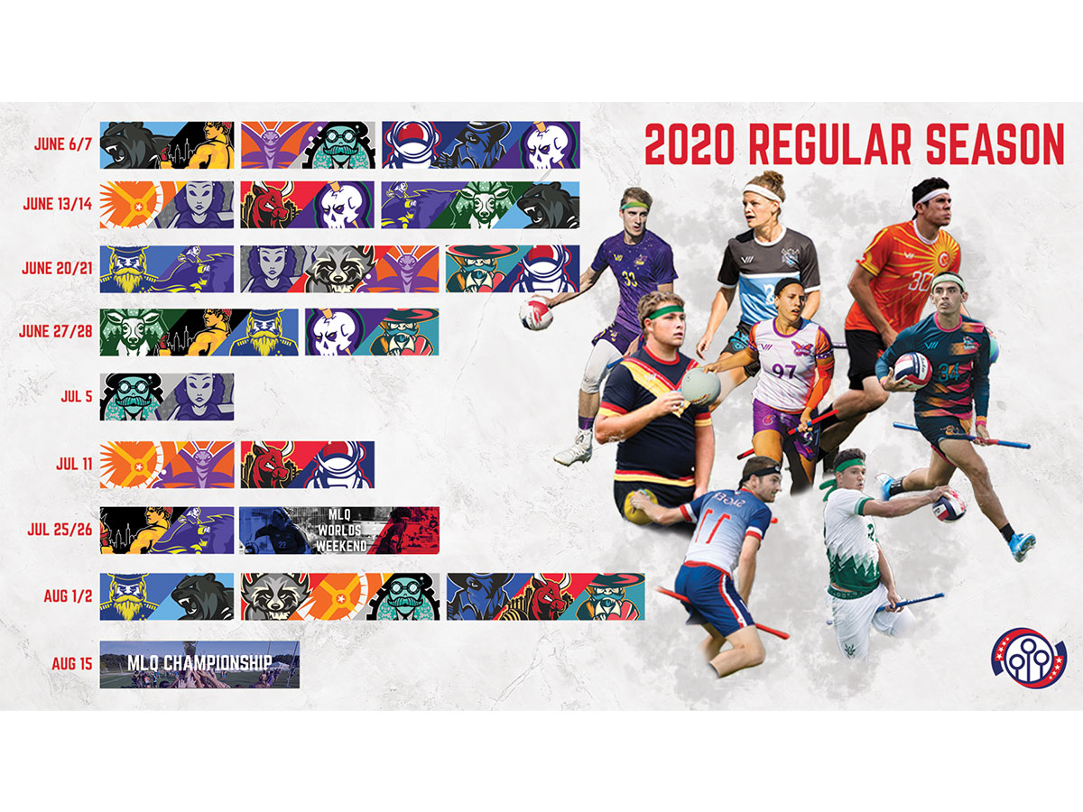
Annual and event-specific expression
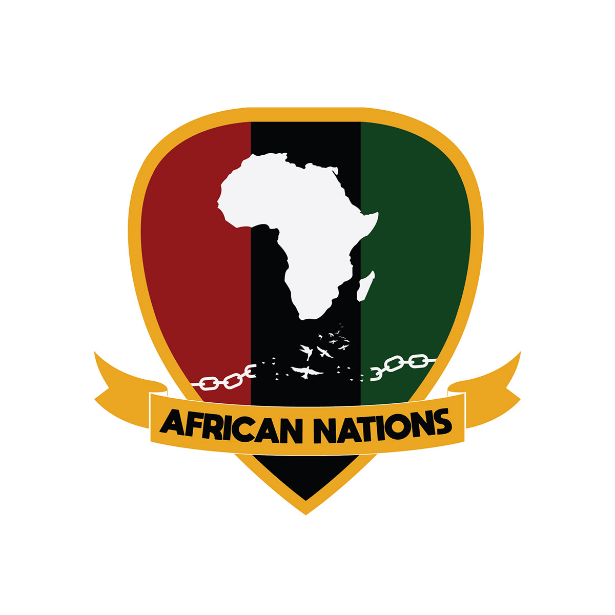
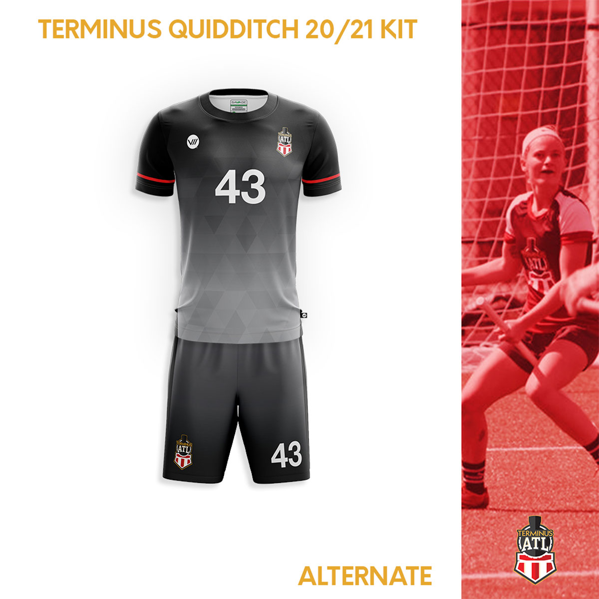
Team identities
Regional and community expression
Communication & engagement
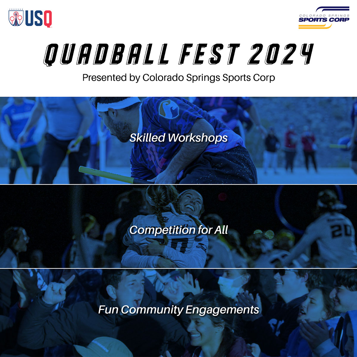
Education, social, apparel, events, community
One system, many applications
Shared system
Structure, typography, hierarchy, and recurring brand cues
Flexible expression
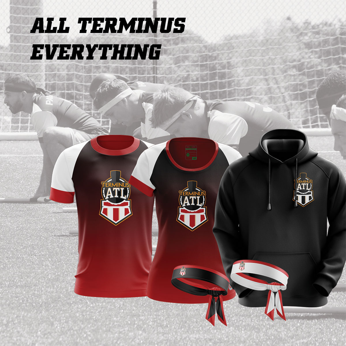
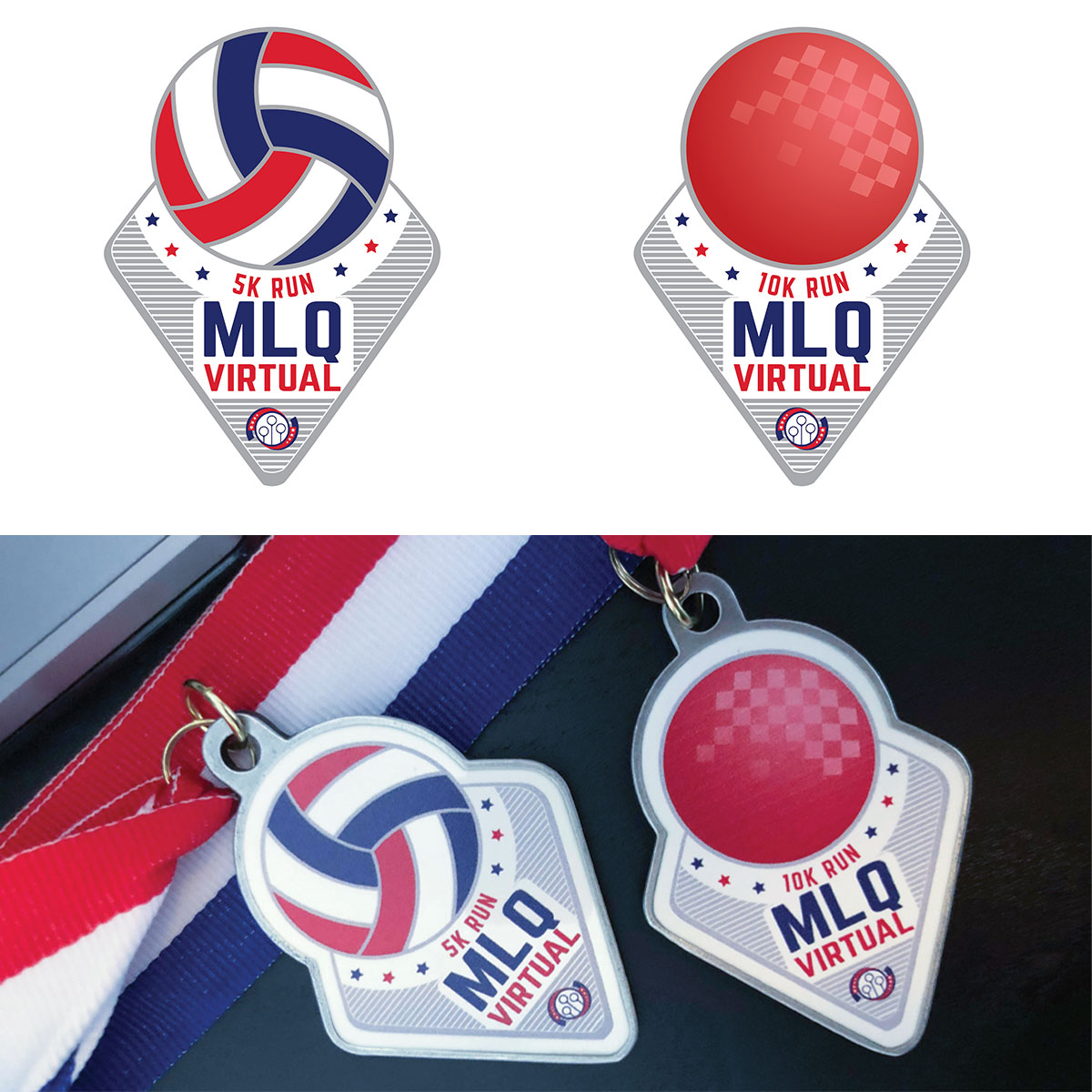
Color, imagery, apparel, merchandise, and event-specific character
The outcome

One framework, many identities

The work established a shared visual framework across national communication, tournaments, teams, educational content, apparel, and community programs. Repeatable rules created continuity across formats while leaving room for individual events and teams to retain their own character.

Shared visual framework
Easier annual and regional adaptation
Preserved individual identity
Scalable across programs and audiences
READY TO START

Has your organization outgrown one-size-fits-all branding?

Tell me where your brand has become fragmented across teams, programs, locations, or events. I’ll review the context and help identify the right starting point for a clearer, more adaptable system.

Tell me about your project
More case studies

Explore related work

Premier Financial Alliance event branding and visual identity case study.Spherical cows case study.Over the wall fitness brand guide case study.