A conceptual fitness brand built around sustainable progress—using momentum, discipline, and resilience without relying on intimidation or perfection-driven clichés.
Over The Wall Fitness was a self-initiated conceptual gym brand created to explore a specific positioning challenge: how can a fitness brand feel powerful and motivating without becoming exclusionary, perfection-driven, or visually generic?
I developed the concept, positioning, visual identity, messaging direction, brand guidelines, campaign applications, apparel concepts, and digital experience mockups. The brand was not launched, so the work should be read as a strategic concept system rather than a record of commercial performance.
Instead of centering transformation promises or intimidation, the concept focused on sustainable progress—building a system that could support strength, speed, balance, and everyday consistency across gym, apparel, campaign, environmental, and digital contexts.
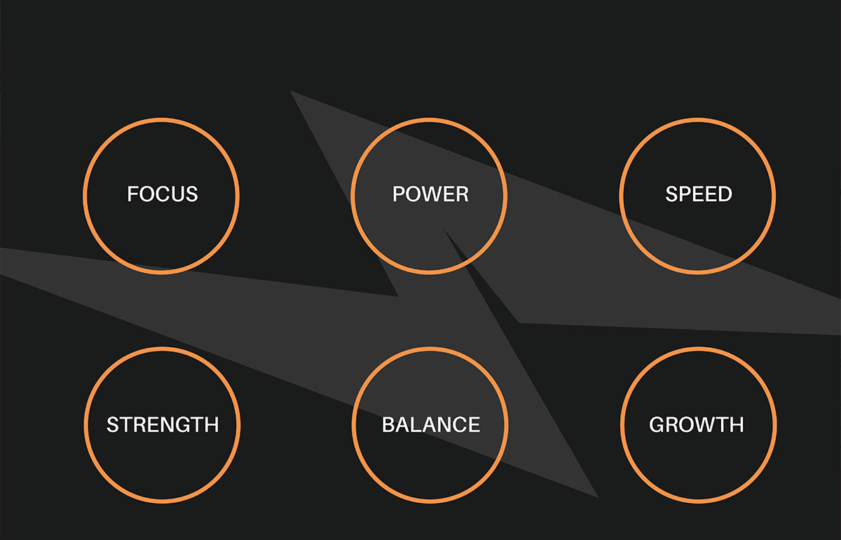
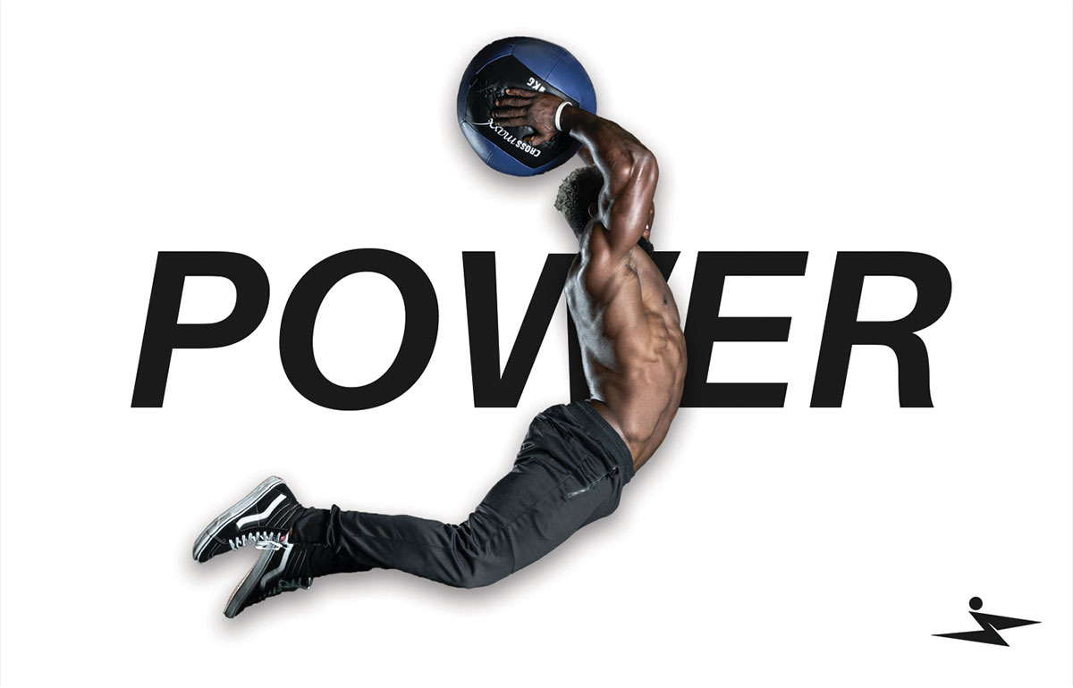
The core idea behind Over The Wall Fitness is simple: progress happens when you push past resistance. “The wall” represents the physical and mental friction that can interrupt consistency—not a reason to ignore pain, exhaustion, or safe limits. The brand promise is about building momentum through disciplined, sustainable effort. The name, tagline, and messaging were designed to work as one system. “Transcend Your Limits” extends the central metaphor, while themes such as Power, Speed, Balance, Focus, Strength, and Growth create a flexible campaign vocabulary rather than six unrelated brand values. This gave the concept enough intensity to motivate performance-minded members while still leaving room for beginners, recovery, and everyday progress.
The wall represents the physical and mental friction that can interrupt consistency—not a reason to ignore pain, exhaustion, or safe limits.
The brand promise is about building momentum through disciplined, sustainable effort.
“Transcend Your Limits” extends the central metaphor.
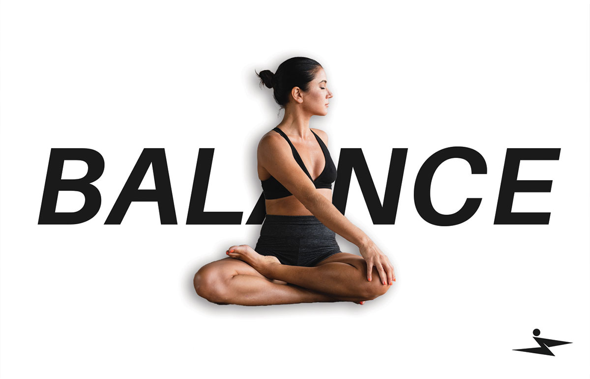
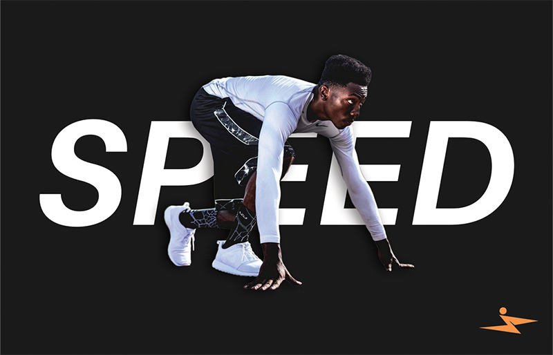
Power, Speed, Balance, Focus, Strength, and Growth create a flexible campaign vocabulary rather than six unrelated brand values.
The identity translated the positioning into a practical visual system. Each element had to communicate energy and direction while remaining clear enough to work across high-intensity training, wellness content, apparel, environmental graphics, and digital experiences. Key decisions included:
A bold wordmark and symbol system built for recognition at small digital sizes and large environmental scales
A restrained black-and-orange palette used for contrast, energy, and visibility, balanced through disciplined spacing and neutral support tones
A clear typographic hierarchy that creates pace in campaigns while preserving readability across digital and environmental applications
Angular graphic accents that express movement and force without overwhelming lower-intensity or wellness-focused content
Together, these choices created an identity that feels energetic without becoming chaotic. The system was intentionally stress-tested across contrasting themes such as power, speed, and balance to see whether one brand could support both performance and sustainable progress.
Starting with a simple category observation—fitness brands often motivate through intensity, transformation, and perfection—the concept explored how that energy could become more inclusive, sustainable, and adaptable.
Motivation without exclusion or perfection pressure
Progress as an ongoing journey
One connected messaging system
A system built to adapt across touchpoints
The resulting identity turns progress into a flexible visual system—combining bold typography, directional energy, motivational language, and adaptable layouts across physical and digital experiences.
Sustainable progress over perfection
“Transcend Your Limits” supported by Power, Speed, Balance, Focus, Strength, and Growth
Bold typography, directional forms, disciplined hierarchy, and high-contrast imagery
A flexible system built for campaigns, apparel, social, environmental, and digital touchpoints
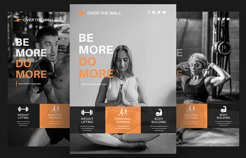
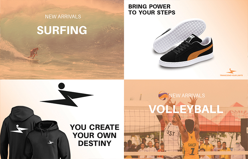
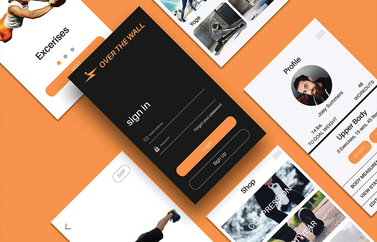
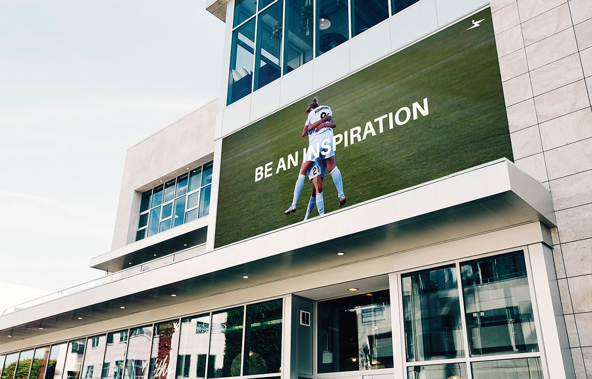
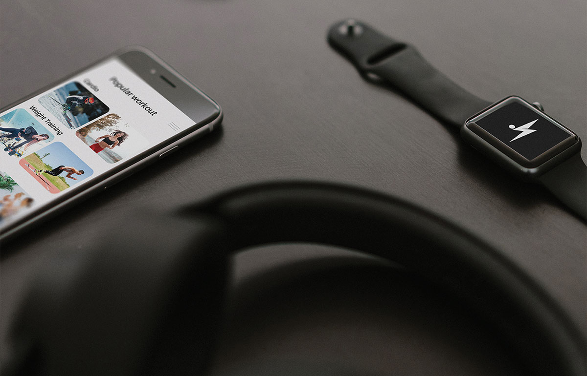
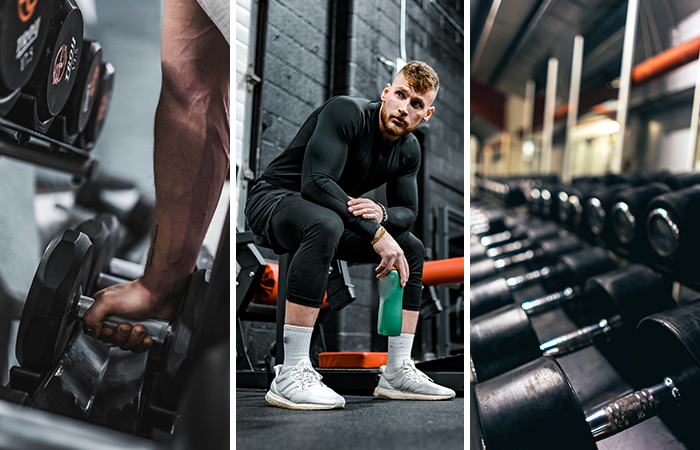
These are conceptual applications—not launched products or campaigns. They test how the same identity and messaging system could flex across campaign creative, apparel, environmental advertising, and digital fitness experiences while preserving a consistent sense of momentum.
The project established a clear positioning platform, a connected naming and messaging idea, and a visual system designed to support both high-intensity and wellness-focused communication.
It also showed where the concept still needed validation: the gym did not launch, the app was not developed, and the campaign, apparel, and environmental applications were not tested with real members.
Share what you offer, who you want to reach, and where the brand feels generic, inconsistent, or too narrow. I’ll help identify the positioning and system decisions that could make the experience clearer, more distinctive, and easier to apply.
Tell me about your project