Work
Tournament of Champions
CASE STUDY

Tournament of Champions — Event Brand Identity

A flexible event identity for the 2022 J.P. Morgan Tournament of Champions, built to connect professional squash, Grand Central Terminal, sponsor visibility, and fast-moving event information across venue and campaign formats.
Brand Identity
Visual System
Event Branding
Art Direction
Brand Guidelines
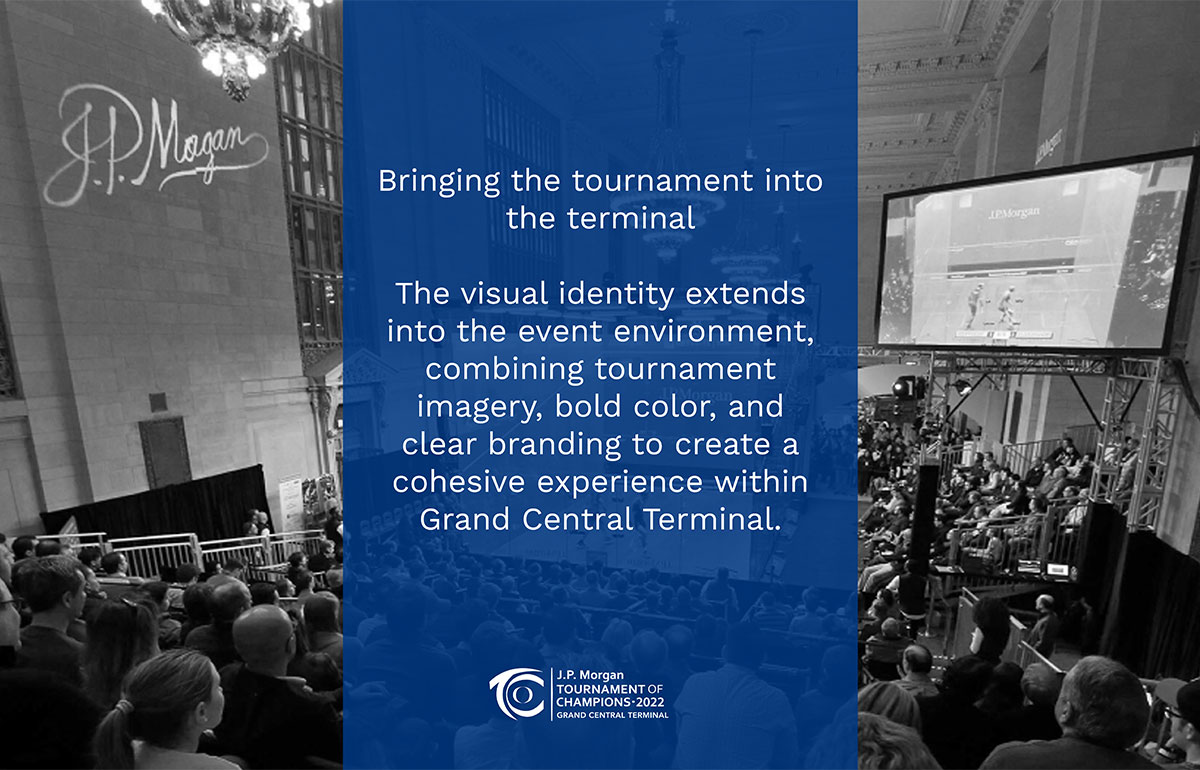
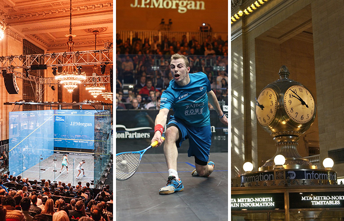
Three-panel collage featuring a squash court competition inside Grand Central Terminal, a professional squash player lunging for a shot during a match, and the iconic Grand Central Terminal information clock.
Engagement
Tournament brand system
My Role
Art direction and visual systems design
Scope
Identity, campaign, schedule, sponsor, and venue applications
Primary Deliverables
Event identity, campaign graphics, schedules, and brand guidelines
System Objective
Establish a repeatable tournament brand system that supports event promotion, participant experience, and long-term recognition across multiple tournaments.
Challenge

The challenge behind the event system

The 2022 J.P. Morgan Tournament of Champions brought professional squash into one of New York’s most recognizable public spaces: Grand Central Terminal. The identity needed to feel worthy of the venue and the level of competition while staying practical across sponsor-led branding, athlete photography, schedules, digital campaigns, promotional assets, and large-scale environmental graphics.

My Role

Evolving the event identity into a repeatable system

My role focused on evolving the event’s visual identity and building a repeatable system for campaign and venue applications. The work balanced event recognition, sponsor visibility, and fast information scanning across very different formats. I contributed to art direction, layout systems, campaign graphics, schedule design, and production-ready applications while working within the event’s established naming, sponsor, and venue context.

One system across venue and campaign formats

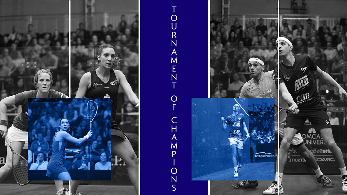
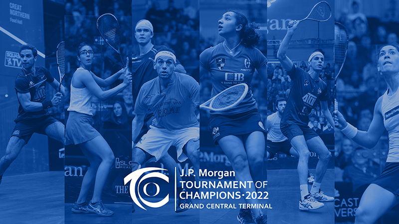
The system was built around three flexible components: athlete photography to communicate the intensity of competition, typography to keep event information and schedules easy to scan, and a restrained blue-and-white palette that maintained continuity with the title sponsor and tournament identity.

01

Athlete photography

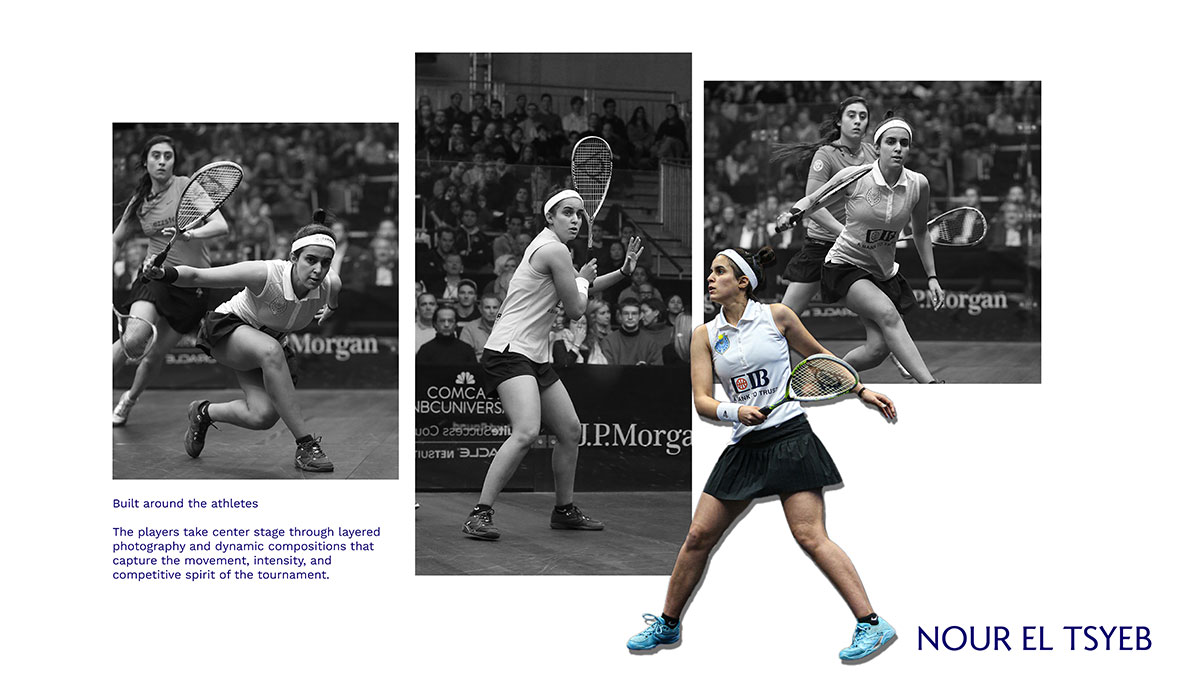
Athlete photography communicated the intensity of competition.

02

Information-led typography

Typography kept event information and schedules easy to scan.

03

Sponsor-aligned color

A restrained blue-and-white palette maintained continuity with the title sponsor and tournament identity.

04

Sense of place

Grand Central imagery connected the tournament experience to the architecture and prestige of the venue rather than treating it as a generic sports backdrop.

05

Repeatable hierarchy

Event name and sponsor, athlete or message, date and schedule details, then the relevant next action.

06

Format flexibility

The structure could expand for large venue graphics or compress for social and promotional placements without losing recognition.

How the event identity worked as one system

The recurring structure, palette, athlete imagery, sponsor visibility, and Grand Central references worked together to keep the event recognizable across campaign and venue formats.

Campaign recognition

Athlete photography, sponsor-aligned color, and the tournament identity created one recognizable campaign language.

Information clarity

The same visual hierarchy kept dense event and schedule information practical and easy to scan.

From event constraints to a repeatable visual system

01 — Event Context

A high-visibility tournament environment shaped by sponsor requirements, Grand Central Terminal, athlete imagery, schedules, promotion, and multiple audience needs.

02 — System Logic

Athlete photography carried the energy and intensity of professional competition.

Clear typography created a consistent hierarchy for schedules, promotions, and event information.

A restrained blue-and-white palette aligned sponsor visibility with the tournament identity.

Grand Central imagery grounded the system in the atmosphere and prestige of the venue.

03 — Applied System

The same visual logic carried across campaign graphics, schedules, sponsor communication, and venue applications without losing recognition.

The system in action

These selected applications show how the same system handled athlete-led promotion, dense schedule information, and venue-driven campaign storytelling. The recurring structure, palette, and Grand Central imagery kept the work connected even as the content and format changed.

Tournament Identity
Promotion
Competition Experience
Event Information
Venue Experience

Event information

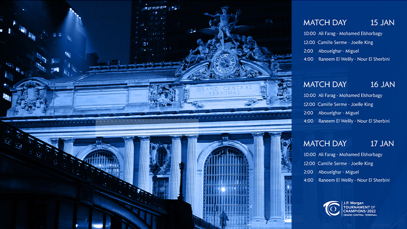
Dense schedule information remained readable while preserving sponsor, tournament, and venue recognition.

Athlete-led promotion

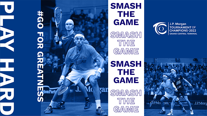
Campaign graphics used athlete photography and the event system to build awareness and anticipation.

Outcome

A clearer foundation for a complex live event

The project established one connected event identity across athlete-led campaign graphics, schedule communication, promotional materials, sponsor visibility, and venue applications.

One recognizable visual language across campaign and venue touchpoints

Clearer hierarchy for schedules, match information, and promotional messaging

Stronger continuity between sponsor presence and tournament branding

A modular system that scaled from social graphics to large-format venue applications

A repeatable foundation for event promotion without losing recognition or clarity

READY TO START

Does your event need one clear identity across every environment?

Share what you’re planning, who needs to understand it, and where the experience has to show up—from campaign assets and schedules to signage, sponsor applications, and on-site communication. I’ll help you identify the system needed to keep it recognizable and practical.

Tell me about your project
More case studies

Explore related work

Sony Electronics digital marketing, email design, and campaign creative case study.Diablo Tools branding, packaging, retail, and marketing design case study.US Quadball branding, event marketing, merchandise, and visual identity design case study.