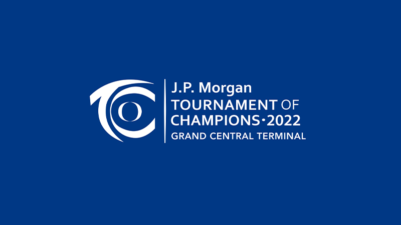
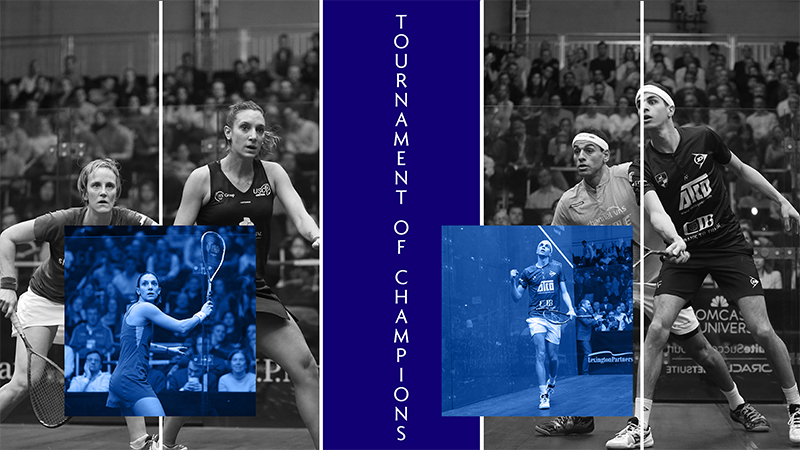
A visual identity created for the Tournament of Champions—designed to establish a bold, recognizable presence ahead of the inaugural event.
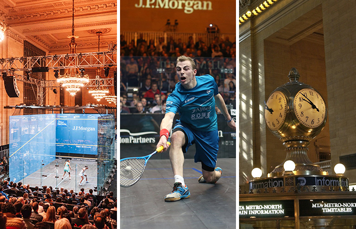
Tournament of Champions is a premier international squash event hosted at Grand Central Terminal. The goal of this project was to evolve the event’s visual identity into a flexible, high-impact system that could scale across digital campaigns, on-site signage, and promotional materials—while honoring the prestige of the venue and the intensity of competition.
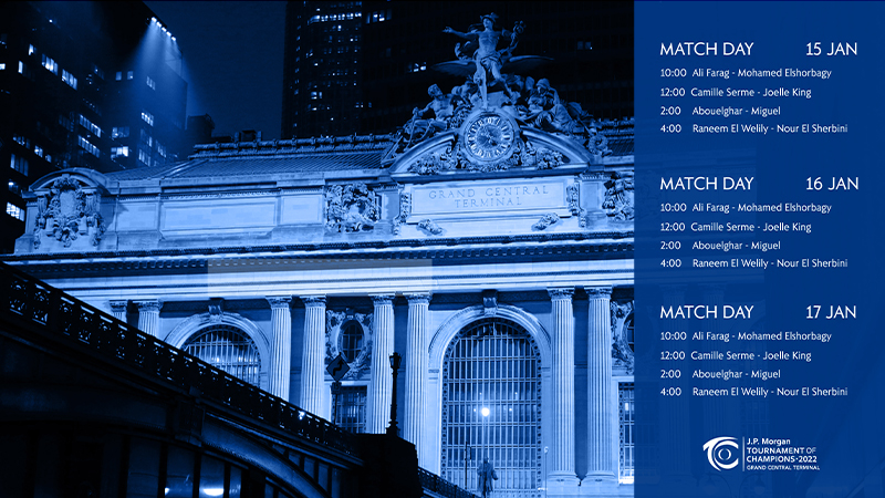
The updated system needed to work seamlessly across formats, from large-scale environmental graphics to performance-driven digital placements, ensuring a consistent and recognizable presence throughout the tournament experience.
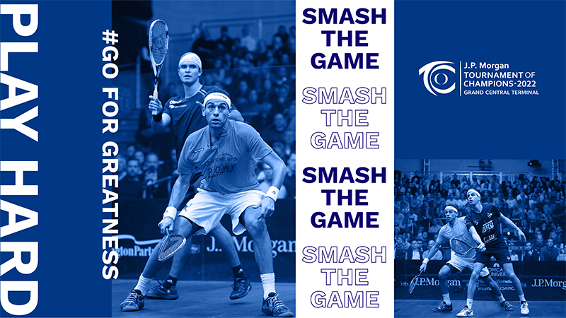
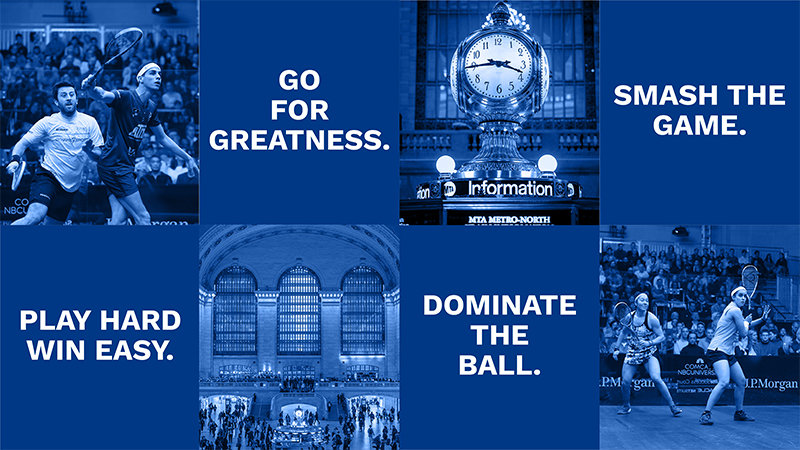
The focus was on creating a bold, modular visual system that could adapt to a wide range of use cases without losing clarity or impact. Photography, typography, and color were treated as core building blocks—designed to work independently or together depending on placement and context.
By establishing a clear hierarchy and repeatable layout logic, the system allowed key messages, schedules, and calls to action to surface quickly, whether viewed on large venue displays, social placements, or campaign assets.
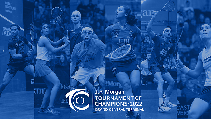
Early applications of the system demonstrated how the identity could flex across campaign visuals, venue signage, and promotional assets—while maintaining a unified look and feel.


Whether you need clearer messaging, a stronger identity, or a better customer experience, we can help you uncover what’s working and where to improve.
Start your project

